AI Coding & The Master Stylesheet: Building Your Living Design Language
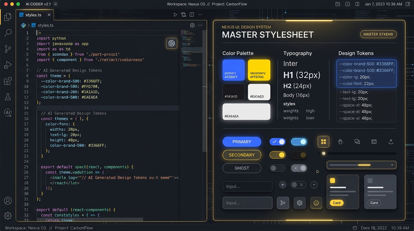
If you have spent any time building web applications with AI coding tools like Claude, Gemini, Cursor, or Antigravity, you have likely run into the UI drift problem.
You ask the AI to build a landing page, and it gives you a clean hero section. You ask it to build a dashboard, and it invents a totally different shade of dark blue. You ask it for a modal dialog, and suddenly it switches from rounded 8px corners to pill-shaped borders with custom inline box shadows. Before long, your codebase is bloated with hundreds of line items of duplicated, slightly mismatched CSS classes and color hex codes.
AI models excel at generating functional HTML and JavaScript, but left without visual guardrails, they code in a vacuum. The solution is not to write a 50-page brand PDF that no LLM will read in a code prompt. The solution is The Master Stylesheet Pattern: a living, single-file UI library built right into your repository that acts as both a visual playground for humans and a precise design anchor for AI agents.
In this post, we assume a lean, fundamentals-first stack: BulmaCSS for clean, classless-friendly layout structures without JavaScript baggage, paired with Alpine.js for reactive UI behaviors (x-data, x-show, x-on:click) declared directly in your markup. We will examine how this pattern powers production sites in our ecosystem, walk through a step-by-step tutorial, and explore advanced steps including DOM layer flattening and direct CSS stylesheet tuning.
Inspecting Real-World Stylesheets: AskLawyer.vn & LOKO.travel
To understand why this pattern is so effective for AI-assisted development, let's look at how it is implemented across two sibling production applications in our repository ecosystem: AskLawyer.vn and LOKO.travel.
Both projects ship a dedicated, standalone route, /stylesheet.html, that imports the exact same CSS custom properties, utility rules, and component JavaScript used across production. But they embody completely distinct visual personalities.
1. AskLawyer.vn: Trustworthy Modern Light-Serif System
In the live AskLawyer.vn Stylesheet, the design language communicates legal authority, clarity, and warmth. The master stylesheet renders an interactive component dictionary with 14 structured sections:
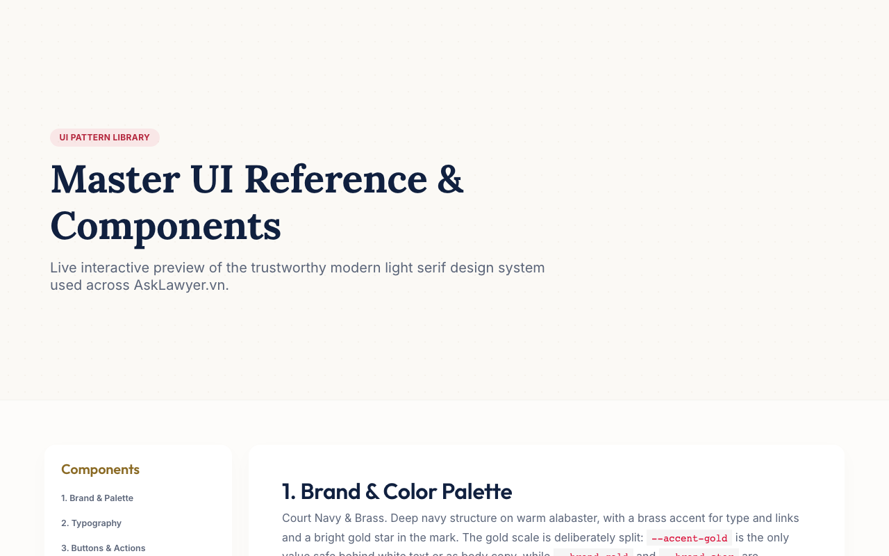
- Typography Hierarchy: Combines Lora Serif for authoritative headers with Inter for dense, highly readable legal text and Outfit for modern sub-headers.
- Strict Token Roles: The color palette uses Court Navy (
#0D1B2A) on Warm Alabaster (#FAF8F5). Crucially, the CSS token scale explicitly splits gold values:--accent-goldis engineered specifically for body copy and contrast compliance against white text, while--brand-goldand--brand-starare reserved exclusively for decorative fills and logo marks. - Court-Rule Baseline Actions: Action buttons (
.btn-gold,.btn-success,.btn-danger) feature colored baseline indicators and glass-morphism card borders.
2. LOKO.travel: Neo-Brutalist Travel Directory
By contrast, the live LOKO.travel Stylesheet showcases a bold, tactile neo-brutalist aesthetic tailored for local urban exploration:
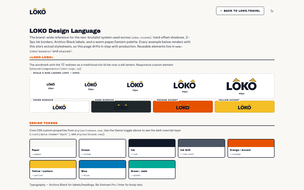
- Brutalist Ink & Shadow Tokens: Built around hard 2-3px ink borders (
--line) and tactile 2px box-shadow offsets (--shadow: 2px 2px 0 var(--line)), paired with a 4-tier radius scale (--radius-smthrough--radius-full). - Display Typography: Uses heavy Archivo Black for uppercase labels and tags alongside Be Vietnam Pro for body text.
- Custom Web Component Primitives: Shared UI elements are defined as modular custom elements like
<loko-button>,<loko-input>,<loko-segmented>, and<loko-logo>, with live dark surface contrast previews embedded directly into the docs page.
Because both stylesheet pages live inside their respective web roots, any AI agent tasked with adding a feature can inspect stylesheet.html or read the CSS tokens to instantly copy the exact class names, attributes, and component structures without guessing.
Tutorial: Building Your Living Design Language with AI
Here is the step-by-step workflow to build your own living master stylesheet and train your AI coding workflows to respect it, assuming a BulmaCSS layout base and Alpine.js for interactivity.
Step 1: Define Your Core CSS Design Tokens
Start by creating a central CSS file (e.g., styles/tokens.css or inside your main stylesheet). Avoid hardcoding colors or static pixel values in your markup. Define everything as CSS custom properties in :root:
View Step 1 Code Implementation
:root {
  /* Color Palette */
  --bg-page: #fdfbf7;
  --bg-surface: #ffffff;
  --text-main: #18191b;
  --text-muted: #64748b;

  /* Brand Accents */
  --primary: #2563eb;
  --primary-hover: #1d4ed8;
  --accent-warm: #f59e0b;

  /* Borders & Shadows */
  --border-color: rgba(15, 23, 42, 0.12);
  --radius-sm: 4px;
  --radius-md: 8px;
  --radius-lg: 16px;
  --shadow-sm: 0 1px 3px rgba(0, 0, 0, 0.05);
  --shadow-card: 0 4px 12px rgba(0, 0, 0, 0.08);

  /* Typography */
  --font-heading: 'Outfit', sans-serif;
  --font-body: 'Inter', system-ui, sans-serif;
}
Step 2: Build the Interactive stylesheet.html Reference
Create a standalone HTML file in your project (e.g., web/stylesheet.html). Combine BulmaCSS layout structures (e.g., .columns, .box, .button) with Alpine.js (x-data) for interactive component state previews:
- Color Swatches: Display color chips with their corresponding CSS variable names so you and the AI can verify contrast and theme harmony.
- Type Scale: Render
<h1>through<h6>, lead text, body paragraphs, and muted captions. - Buttons & Actions: Show primary, secondary, outline, ghost, loading, disabled, and icon button variants with Alpine.js click handlers.
- Form Elements: Standard text inputs, focus states, error highlights, checkboxes, radio buttons, and select dropdowns.
- Cards & Containers: Basic content cards, elevated cards, and stat widgets.
View Step 2 Code Implementation (BulmaCSS + Alpine.js)
<!-- Interactive BulmaCSS + Alpine.js Button Group in stylesheet.html -->
<div x-data="{ loading: false }" class="buttons">
  <button class="button btn-gold" :class="{ 'is-loading': loading }" @click="loading = true; setTimeout(() => loading = false, 1500)">
    Primary Action
  </button>
  <button class="button btn-outline-gold">Secondary Outline</button>
</div>
Step 3: Point Your AI Agents to the Stylesheet
Once your stylesheet.html is live, update your project instructions (such as AGENTS.md or your system prompts) to instruct AI tools to reference the stylesheet before generating UI code:
View Agent Rule Instruction
When building new web interfaces or components:
1. Stack baseline: Use BulmaCSS layout classes + Alpine.js (`x-data`, `x-show`, `@click`) for interactivity.
2. Refer to `web/stylesheet.html` and `styles/tokens.css` for approved design tokens and component patterns.
3. Keep DOM layers flat: Avoid deep nested wrapper `<div>` structures.
4. Apply subtle premium microanimations: Use high-end spring curves (`cubic-bezier(0.34, 1.56, 0.64, 1)`), hover scale feedback, and directional arrow shifts.
5. Do not invent new hex colors or heavy multi-pass blur shadows without updating `tokens.css`.
The Advanced Step: Adding Your Personal Touch in the Stylesheet
AI can generate 85% of your design system baseline quickly: grid alignment, basic button states, and functional forms. But if you rely entirely on AI generation, your application will still feel generic, like a standard default template.
The solution is to open the master stylesheet CSS directly and refine key visual, component, and performance mechanics by hand.
1. Fine-Tuning Token Roles & Contextual Accent Colors
AI tools frequently use a single brand color variable for both large background fills and inline text links, resulting in poor accessibility contrast. Hand-crafting a split token scale with contextual accent tints gives your UI depth while maintaining accessibility:
View Code Implementation
/* Contrast-safe split gold tokens */
--accent-gold: #b3800f;        /* High contrast: Safe for body text and link copy */
--brand-gold:  #d4af37;        /* Rich tone: Designed for graphic borders and badges */
--brand-star:  #ffd700;        /* Bright pop: Reserved strictly for vector logo fills */

/* Contextual tint & glow tokens for state feedback */
--accent-blue:      #2563eb;
--accent-blue-tint: rgba(37, 99, 235, 0.08);  /* Subtle card background tint */
--accent-teal:      #0d9488;  /* Success / Escrow indicator */
--accent-coral:     #e11d48;  /* Warning / Action required */
2. Asymmetric Border Styles & Accent Stripes
AI models almost universally default to symmetric border radii (border-radius: 8px on every side). Breaking symmetry with custom corner curves or thick accent edge lines gives components instant architectural personality:
border-radius: 18px 4px 18px 4pxborder-left: 5px solid var(--accent)border-top: 4px solid var(--gold)View Code Implementation
/* Asymmetric leaf-corner radius for cards */
.card-asymmetric {
  border-radius: 16px 4px 16px 4px;
  border: 1px solid var(--border-color);
  background: var(--bg-surface);
}

/* Court-rule left accent stripe on primary action containers */
.accent-stripe-card {
  border-left: 4px solid var(--accent-blue);
  border-top: 1px solid var(--border-color);
  border-right: 1px solid var(--border-color);
  border-bottom: 1px solid var(--border-color);
  border-radius: 0 8px 8px 0;
}
3. Prefix & Suffix Component Icon Slots
Plain text buttons generated by AI feel flat. Embedding structured prefix icon slots (for leading context badges) and suffix arrows (for directional intent) gives interactive components visual structure and purpose:
View Code Implementation
/* Component layout with prefix & suffix slots */
.btn-slotted {
  display: inline-flex;
  align-items: center;
  gap: 8px;
  padding: 0.625rem 1.25rem;
  font-weight: 600;
  border-radius: var(--radius-md);
}

/* Prefix monotone icon badge */
.btn-slotted .prefix-icon {
  display: flex;
  align-items: center;
  justify-content: center;
  width: 18px;
  height: 18px;
  opacity: 0.85;
}

/* Suffix action indicator (shifts right on hover) */
.btn-slotted .suffix-arrow {
  transition: transform 0.15s ease;
}

.btn-slotted:hover .suffix-arrow {
  transform: translateX(3px);
}
4. Tactile Shadow & Border Physics
Standard AI code defaults to soft, blurry CSS box-shadows (0 10px 15px rgba(0,0,0,0.1)). By directly editing the CSS, you can introduce custom tactile physics, such as LOKO.travel's hard-ink brutalist shadow offset or crisp multi-layered borders:
box-shadow: 3px 3px 0 #16191cbox-shadow: 0 8px 24px rgba(...)View Code Implementation
/* Custom Human Shadow Offset Physics */
.tactile-card {
  background: var(--bg-surface);
  border: 2px solid var(--text-main);
  box-shadow: 3px 3px 0 var(--text-main);
  transition: transform 0.12s ease, box-shadow 0.12s ease;
}

.tactile-card:hover {
  transform: translate(-2px, -2px);
  box-shadow: 5px 5px 0 var(--text-main);
}
5. Custom Spring Physics & Subtle Premium Microanimations
One of the most effective magic phrases in AI prompt engineering is instructing agents to implement subtle premium microanimations. Instead of generic linear delays (transition: all 0.3s ease), pair this prompt instruction with hand-tuned cubic-bezier spring curves for button clicks, hover elevations, and modal openings:
View Code Implementation
/* Bouncy spring interaction for interactive triggers */
.btn-spring {
  transition: transform 0.15s cubic-bezier(0.34, 1.56, 0.64, 1), box-shadow 0.15s ease;
}

.btn-spring:active {
  transform: scale(0.96) translateY(1px);
}
6. Editorial Font Pairings & Optical Spacing
AI defaults to standard system sans-serif stacks. Elevate the feel of your site by introducing an editorial display font for page titles, combined with subtle uppercase tracking for UI metadata tags:
View Code Implementation
.section-tag {
  font-family: 'Archivo Black', sans-serif;
  font-size: 0.75rem;
  letter-spacing: 0.08em;
  text-transform: uppercase;
  color: var(--text-muted);
}
7. Performance & DOM Layer Flattening: Taming Heavy AI Shadows
Left unguided, AI models default to heavy visual effects: multi-layered blur shadows (box-shadow: 0 20px 25px -5px rgba(0,0,0,0.1), 0 8px 10px -6px rgba(0,0,0,0.1)), complex backdrop-filter: blur(16px), and 5 to 6 levels of deeply nested wrapper <div> elements for simple cards or modal triggers. On mobile devices or laptops running on battery, stacked blur compositing layers spike GPU render passes and make browsers run hot.
The fix is DOM Layer Flattening. Instruct your AI agents to flatten wrapper trees down to single semantic elements, and replace multi-pass fuzzy blurs with crisp 2D solid offset shadows or clean borders. Combining BulmaCSS layout classes with Alpine.js (x-data) reactive directives preserves full interactivity while eliminating DOM bloat and GPU lag.
View Flattened BulmaCSS + Alpine.js Code
<!-- Flattened DOM card with Alpine.js reactive toggle -->
<div x-data="{ expanded: false }" class="box flat-card">
  <div class="is-flex is-justify-content-space-between is-align-items-center">
    <span class="has-text-weight-bold">Optimized Component</span>
    <button @click="expanded = !expanded" class="button is-small btn-gold">
      <span x-text="expanded ? 'Hide Details' : 'Show Details'">Show Details</span>
    </button>
  </div>
  <div x-show="expanded" class="mt-3 is-size-7 has-text-grey">
    Flat DOM structure with zero wrapper bloat.
  </div>
</div>
Conclusion
Building web applications with AI does not mean surrendering your design identity to generic templates or sacrificing browser performance to bloated DOM structures. By creating a living stylesheet.html inside your project, you give your AI coding assistants a clear single source of truth for every component, token, and state.
When you combine AI generation with deliberate refinement (flattening DOM trees, using BulmaCSS and Alpine.js, refining CSS tokens, adding prefix/suffix icon slots, styling asymmetric borders, and tuning spring keyframes directly in the stylesheet), you get fast feature implementation alongside a distinct, high-performance design language.